Decor Palette Basics: Choosing Colours That Work With Your Light
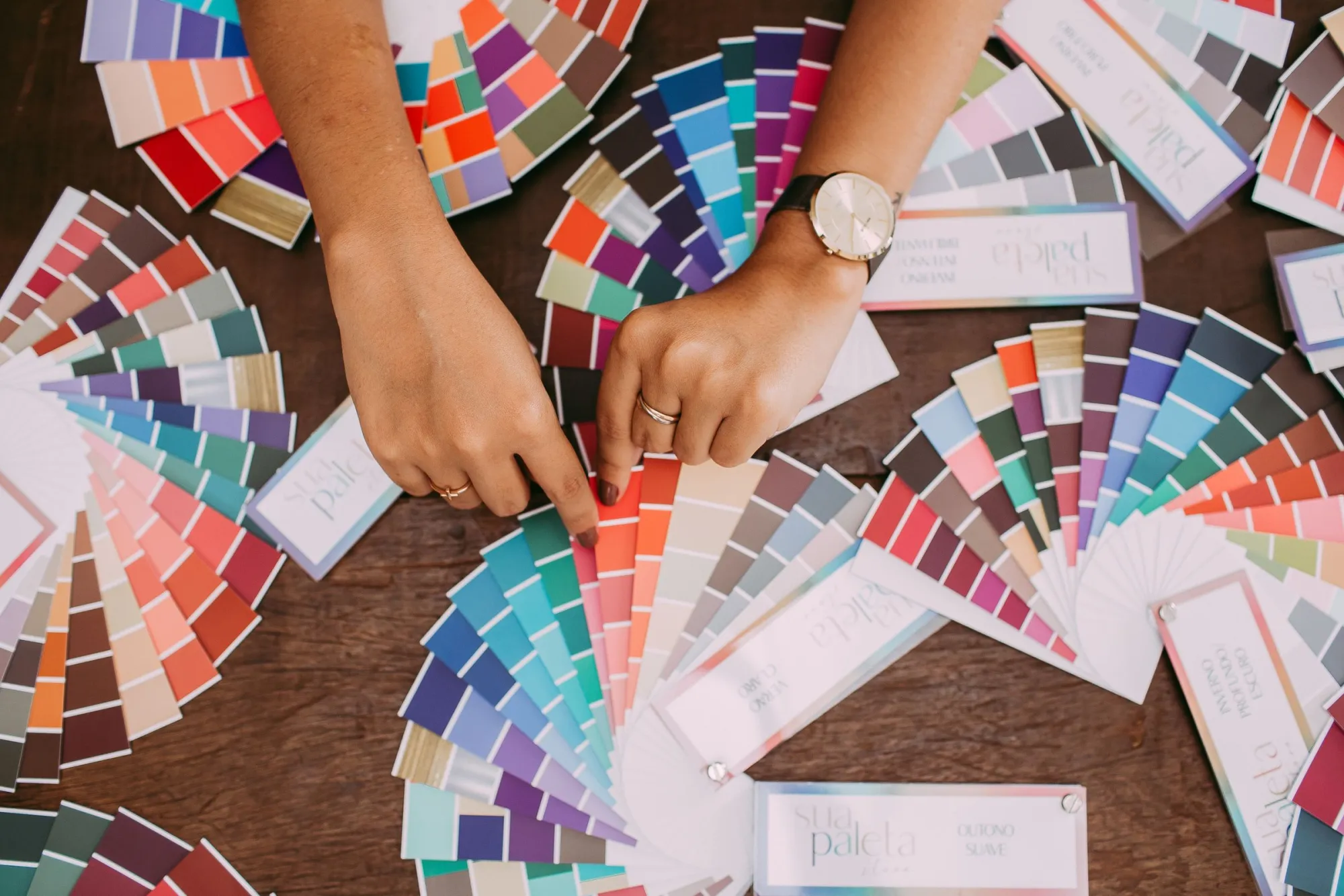
Most people choose paint and fabrics under the shop's lights, then wonder why everything looks different at home. Colour is never seen on its own: it is always seen under some kind of light. A palette that looks fresh in daylight can look dull under warm evening lamps, and a cosy colour can turn muddy in a north-facing room.
That is why decor and lighting are best planned together. This guide covers the basics of building a palette and making it work with your light.
Start with what will not change
Before choosing anything new, list what is staying:
- Floors: timber, tile, concrete or carpet.
- Fixed elements: kitchen units, stone worktops, fireplaces, built-in joinery.
- Large furniture you plan to keep, such as a sofa or dining table.
- The view: greenery, sea, city or a neighbouring wall all affect a room.
These set the undertone of the room. A honey-coloured oak floor pushes a room warm; grey tiles push it cool. Your palette should work with them, not against them.
The 60-30-10 idea
A simple, widely used starting point is to split the room's colour roughly as:
- About 60%: the main colour. Usually walls and large surfaces. Often a calm neutral or a soft, muted colour.
- About 30%: the secondary colour. Larger furniture, curtains, a rug or an accent wall.
- About 10%: the accent. Cushions, artwork, a lamp, a vase. This is where stronger colour can live.
It is a guideline, not a law, but it helps avoid the two common problems: a room with no contrast at all, and a room where every object competes for attention.
Undertones matter more than names
"White", "beige" and "grey" each come in hundreds of versions. The key is the undertone:
- Warm undertones: yellow, red or pink. These feel cosy and suit warm lighting.
- Cool undertones: blue, green or violet. These feel fresh and calm, and suit rooms with lots of daylight.
- Neutral undertones: balanced, more flexible.
Hold paint samples against something truly white (a sheet of printer paper) to see their undertone more clearly. Mixing warm and cool undertones in the same family, for example a warm white wall next to a cool white ceiling, often looks slightly "off" even if you cannot say why.
Texture is part of the palette
A room in one colour can still be interesting if it has varied textures: linen, wool, timber, stone, matte paint, a bit of metal or glass. Texture is also where lighting helps. Light grazing across a textured wall or a woven fabric creates shadows that add depth, while flat front-on light hides texture.
How light changes colour
Three things decide how your palette will look:
- Daylight direction. In the northern hemisphere, north-facing rooms get cooler, softer light; south-facing rooms get warmer, stronger light. East and west change through the day. (It is reversed in the southern hemisphere.)
- Colour temperature of your lamps. Warm white (around 2700K) makes warm colours glow and can make cool blues and greys look slightly flatter. Cooler light does the opposite.
- Colour rendering. Lamps with good colour rendering (a CRI of 90 or more is a common target) show colours more faithfully. Poor colour rendering can make even a well-chosen palette look tired.
Test before you commit
- Paint large swatches (or use sample boards) on more than one wall.
- Look at them morning, afternoon and evening, with your actual lamps on.
- Put fabric samples next to the paint, on the floor where the rug will go, and against the sofa.
- Live with the samples for a few days before deciding.
A few reliable palettes
- Warm neutral: soft warm white walls, oak, linen, terracotta or ochre accents. Very forgiving under warm light.
- Calm coastal: off-white with a hint of grey, pale timber, muted blue-green, natural rope and rattan.
- Deep and cosy: a dark green or deep blue on the walls, brass or bronze accents, warm lamps. Dark colours look rich under warm, layered light and gloomy under a single overhead fitting.
- Contemporary monochrome: black, white and greys with one strong accent colour. Works best with good colour rendering and careful accent lighting.
Bringing light and decor together
A LightDecor plan includes a decor list sized to each area, with buy links, alongside the light spots and their colour temperatures. Because the lighting and the decor are planned together in the same 3D model, you can see how a palette sits with the light before you buy anything.
Start with what stays, pick undertones that agree, use 60-30-10 as a guide, and always test under your own light. That is most of the secret of a room that feels "put together".
A 3D model per area with every light spot marked, a light-spot file, a decor list with buy links, a PDF and one ZIP.
See the plans → Next: How Many Light Spots Does a Living Room Need? →