Colour Temperature Explained: Choosing Kelvin for Every Room
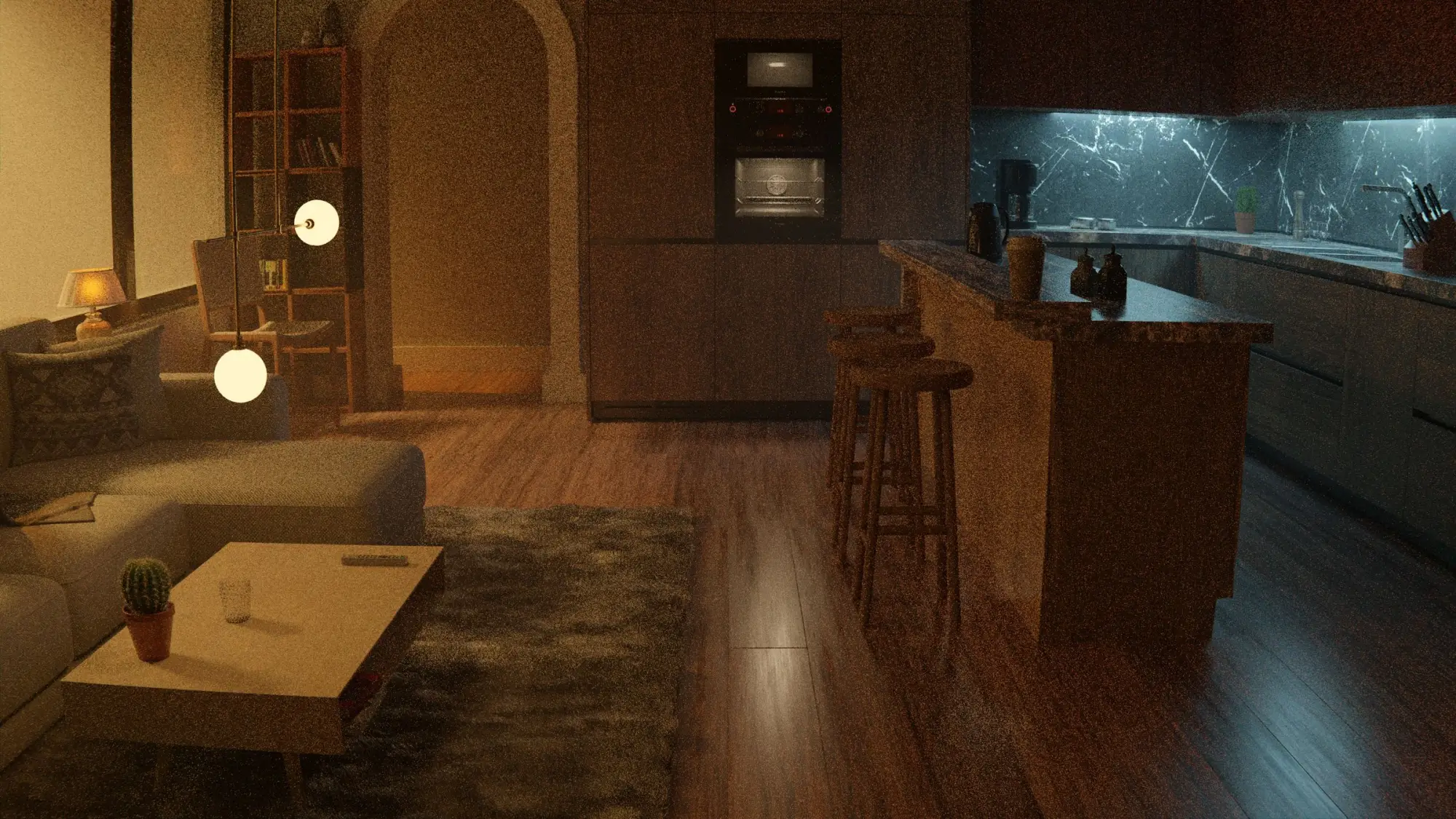
Two bulbs can be equally bright and still make a room feel completely different. The reason is colour temperature: how warm (amber) or cool (bluish-white) the light looks. Getting it right is one of the easiest ways to make a home feel calm and consistent. Getting it wrong is why some rooms feel like an office and others look patchy.
What Kelvin means
Colour temperature is measured in Kelvin (K). The scale can seem backwards at first: lower numbers look warmer, higher numbers look cooler.
A rough guide to how common values look:
- 1800K–2200K: very warm, like candlelight or a dimmed filament bulb. Cosy and intimate.
- 2700K: warm white. The classic "home" light, similar to a traditional incandescent bulb.
- 3000K: soft white. Still warm but a little crisper. Popular in kitchens and bathrooms.
- 3500K–4000K: neutral white. Clear and fresh, good for work surfaces and garages.
- 5000K–6500K: cool white or "daylight". Very crisp, bluish. Common in offices, workshops and retail.
These descriptions vary a little between manufacturers, so check the number on the packaging, not just the name.
Room-by-room suggestions
There are no strict rules, but these starting points work in most homes:
- Living room: 2700K for general light, with warmer lamps (2200K–2400K) for evenings.
- Bedroom: 2700K, warmer still for bedside lamps.
- Dining: 2700K. Warm light flatters food and faces.
- Kitchen: 3000K overall, with the option of 3000K–4000K under cabinets for prep work.
- Bathroom: 3000K, with good light on both sides of the mirror.
- Home office: 3000K–4000K at the desk; keep the rest of the room warmer if it is shared.
- Hallways and stairs: match the rooms they connect, usually 2700K–3000K.
- Outdoors: 2700K–3000K for terraces and gardens.
Keep it consistent
The most common problem is mixing colour temperatures in one view. A 2700K lamp next to a 4000K ceiling light looks like a mistake, and open-plan spaces make this very visible.
Simple rules:
- Pick one main colour temperature for the home (often 2700K or 3000K) and use it for all ambient light.
- Only deviate on purpose, for example cooler task light in a kitchen or warmer lamps in a lounge.
- Buy from the same product line where possible. Two "2700K" products from different brands can still look slightly different.
Colour rendering matters too
Colour temperature tells you the tint of the light. Colour rendering, usually given as CRI (Colour Rendering Index), tells you how accurately the light shows colours. A low-CRI bulb can make skin look grey and food look dull even at a pleasant colour temperature.
For homes, many designers look for a CRI of 90 or above, especially in kitchens, bathrooms, wardrobes and anywhere you choose clothes or apply make-up.
Tunable and dim-to-warm lighting
Two technologies give you more flexibility:
- Tunable white lets you change colour temperature, for example cooler during the day and warmer in the evening.
- Dim-to-warm fittings get warmer as you dim them, imitating how traditional bulbs behaved. This is a simple way to get bright, clear light when needed and cosy light later.
Both are useful, but they add cost and complexity. In many rooms a fixed warm white on a good dimmer is enough.
Evenings and sleep
Many people prefer warmer, dimmer light in the evening because it feels more relaxing. Using warm lamps and turning off bright overhead light after dinner is an easy habit that makes a home feel calmer. If you have specific concerns about light and sleep, speak to a health professional rather than relying on bulb packaging.
Special settings
- Yachts: warm white suits wood interiors; red night lighting is common for passages.
- Camping: warm light (2200K–2700K) feels relaxed and tends to attract fewer insects than cool white.
- Art and displays: neutral to warm white with high colour rendering shows colours well.
How we use Kelvin in a plan
In a LightDecor plan, every light spot in the light-spot file (CSV and JSON) lists its colour temperature in Kelvin, alongside its position, height and brightness. That makes it easy to buy matching lamps and to make sure each room, and the view between rooms, stays consistent.
Choose one warm base, add cooler light only where a task needs it, and pay attention to colour rendering. Your home will look calmer and more finished, without changing a single piece of furniture.
A 3D model per area with every light spot marked, a light-spot file, a decor list with buy links, a PDF and one ZIP.
See the plans → Next: How to Measure a Room for a Lighting Plan →